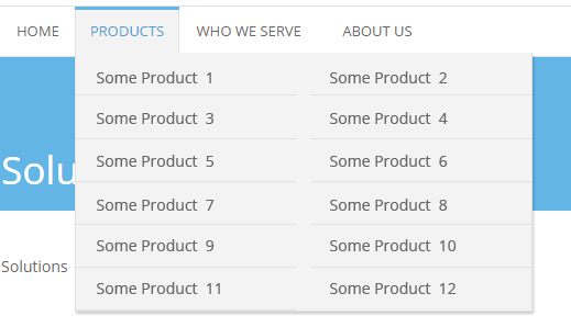
This is what we will be making:

Your menu may look different from the picture, it doesn’t matter. What we are looking for are the two columns of sub-items in the drop down. The solution fits for any theme design. What you should have, though, is the WP Navigation Menu, created by you in Appearance -> Menus. Not an auto-generated list of pages. This is the only must.
Say, you have your main menu in place, and you have some 12 sub-items for the Products menu item. Here’s how you split them in 2 columns in your sub-menu:
 1. Go to Appearance -> Menus and select the menu you want to edit.
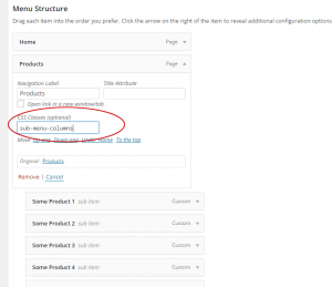
2. Type sub-menu-columns in the top menu item CSS Classes (optional) field. In our case – it’s the Products. See image for help.
If you don’t see CSS Classes (optional) field in the menu item box, then click Screen Options at the top right corner of the screen and check CSS Classes checkbox.
3. Click SAVE MENU button.
4. WordPress assigns class sub-menu to the ul that holds sub-item li-s. In your CSS find (or add) .sub-menu selector and add this line to declaration: width: 410px;. You can set width to anything you want, actually.
5. Then add this block of CSS to your stylesheet:
.sub-menu-columns ul.sub-menu li {
display: inline-block;
float: left;
width: 200px;
}
.sub-menu-columns ul.sub-menu li:nth-child(odd) {
float: left;
margin-right: 10px;
}
.sub-menu-columns ul.sub-menu li:nth-child(even) {
float: right;
}
You may want to tweak the widths, of course, or add some fancy styling. But the general idea is that simple: float odd children left, float even children right, give them widths so they don’t stray. Remember to set width of the sub-menu ul to the sum of li widths plus margin.
